Customization - Flowbite Svelte
Learn how you can overwrite the default style with you own CSS
When working with components, you may want to customize their default or specific classes. Here’s a guide on how to achieve that. Starting from version 0.38.0, we have transitioned from using classnames to tailwind-merge, which allows us to easily overwrite classes and avoid style conflicts. This update brings enhanced flexibility and simplifies the process of customizing component styles.
Understanding Props #
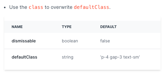
Each component has a props section where you can find information on how to customize classes. For example, let’s refer to the Alert Props section.

In this case, you can overwrite the defaultClass by adding the class prop. Here’s an example:
- Svelte
<script>
  import { Alert } from '$lib'
</script>

  <Alert class="text-xl">Add a class to overwrite the default class!</Alert>
Thanks to tailwind-merge, you can efficiently merge Tailwind CSS classes without style conflicts. One of its features is that the last conflicting class wins. Please read more details about Merging behavior
Importance of ! for Some Components #
In Tailwind CSS, you can make any utility class important by adding a ! character at the beginning of the class name. Certain components may require this approach to successfully overwrite styles. Here’s an example:
- Svelte
<script>
	import { Button } from 'flowbite-svelte'
</script>

<Button class="!bg-blue-500">
	 Blue Button
</Button>
<Button class="!bg-green-500">
	 Green Button
</Button>
Overwriting Specific Classes #
While the class prop can be used for most components, some components with a complex structure may require multiple props. For instance, let’s consider the Banner component has two relevant props: classDiv for divClass and classInner for innerClass. To overwrite the divClass, you can use the classDiv prop:
- Svelte
<script>
	import { Banner, Skeleton, ImagePlaceholder } from 'flowbite-svelte'
</script>

<Skeleton class="py-4"/>
<ImagePlaceholder class="py-4"/>

<Banner id="default-banner" position="absolute" classDiv="dark:bg-green-500 dark:border-green-400">
  <p class="flex items-center text-sm font-normal text-gray-500 dark:text-white">
    Overwriting divClass and innerClass
  </p>
</Banner>
You can test this by switching to dark mode and observing the background color change to green.
We hope these instructions help you confidently customize component classes. Feel free to reach out if you have any further questions!
Global customization #
To customize the Flowbite-Svelte component globally, follow these steps:
Start by creating your own component based on Flowbite-Svelte.
Create a new file for your button component in the lib directory:
// src/lib/MyButton.svelte
<script>
  import { Button } from 'flowbite-svelte'
</script>

<Button color="green" pill class="p-8">
  <slot />
</Button>
Once you have created your button component, you can use it in your project.
In your project, import your custom button component:
<script>
  import MyButton from "$lib/MyButton.svelte"
</script>
Use the custom button component in your project by adding the following code:
<MyButton>My New Button</MyButton>With these steps, you can customize and use your own button component globally based on Flowbite-Svelte. Feel free to modify the styles and properties of the component according to your requirements.